Everyone wants higher conversion rates and following these web design practices can definitely help. Plus, it will for sure boost your email conversion in a snap.
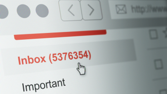
Let’s Talk Numbers
Before getting into the web design practices of increasing conversions, it’s important to talk about numbers.
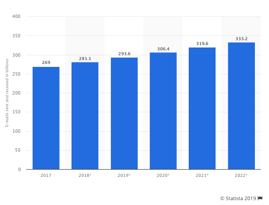
In 2018 alone, over 280 billion emails were sent and received daily worldwide. By 2022, it is estimated that this number will exceed 330 billion daily emails.
So, what does this mean?
It means that even once your target audience subscribes to your email marketing list, you will have to work hard to get their attention.
Even if you nail your subject line, you might be stuck with a lot of people opening your emails, but never taking any action. Why could this be?
Many people read emails while on-the-go, meaning that their time and attention are extra limited. Emails not only must have solid copy, but be pleasing to the eye with effective design.
These web design practices boost email conversion, and knowing them will help you write emails that get the results you want.
1. A Balanced Design
The more choices you present subscribers with, the more likely they are to become confused and potentially not make a decision at all. Your emails need to be simple, mobile-friendly and functional, without anything extra to bog down your readers.
Some web design principals boost email conversion, including:
- Get rid of design elements that don’t point readers toward a goal
- Consistent visual branding
- Get rid of clutter in the header and footer
- Make sure each section has an obvious heading, crisp body text, and an inviting CTA
SEE ALSO: Navigating the Web Design Process
2. Have A Clear Visual Hierarchy
It’s not just about your information, but how you present it. Blocks of text and endless sentences just don’t look good. They can also intimidate readers, who are likely to skim and skip massive paragraphs.
Organize information in order of importance and break it up so people know what to focus on.
You can also do this using color, by making important things brighter.
The squint test is a popular way of determining if the right design elements on a landing page pop. You can squint and see if, even while blurry, you can pick out the important elements in your emails.
If you don’t want to squint yourself, try out this chrome extension to blur your screen.
3. Directional Cues
Directional cues are visual elements that are used to make a person focus on a specific thing. In this case, you would want to use visual cues to draw subscribers to your CTA button.
The human brain subconsciously registers these signals and people respond to them. These cues can be as obvious as arrows or pointing fingers, or more suggestive. An example of a suggestive cue is a person looking toward your CTA.
Remember, do not go overboard with these cues. If you have too many arrows, for example, people will find it forced and clumsy.
4.Use High-Quality Images
These web design practices boost email conversion, and images play a big role. They cannot be forgotten.
People process images better and faster than they do text. In fact, people following directions with both text and images do 323% better than people following unillustrated directions.
Illustrative web design practices boost email conversion.
However, you don’t want to go overboard and clog your content with images that don’t fit your brand or content. Keep these tips in mind:
- Images should match your brand
- Use photos that feel consistent in an email
- Avoid lifeless stock photos
- Use photographs of people displaying positive emotions when relevant
SEE ALSO: 11 Stock Video, Stock Image, and Stock Audio Resources for Digital Branders
5. A Colorful CTA
Color is a powerful visual communication tool. Color can inspire emotion, influence people’s attitudes, and change the way people think about a brand. Don’t overlook color in your emails, especially in your CTAs.
However, there is not one color that fits every brand and situation and is guaranteed to boost conversions. While many suggest that red is a one-size-fits-all solution, it is not that simple.
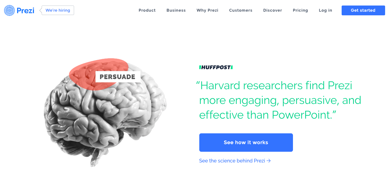
The real goal is to use color to make your CTA stand out from the background. One of the most basic web design best practices is that o
On their site, Prezi has both a primary and secondary CTA in blue. This distinguishes these buttons from the rest of the web page.
6. Focus On Your Call-To-Action
When it comes to page design, often less is more. If you have stuffed your emails with CTAs, it can make it hard for subscribers to know where to click. Having too many choices can actually create stress.
This is not what you want. You want one obvious and strong CTA that makes it easy for readers to know what to do.
Having too many CTA buttons or one that is way too large can seem forced, and make people dislike your content. So, your single CTA should have color and size that flows with your email.
SEE ALSO: The Top 5 Ways to Create High Converting CTA Buttons
7. Negative Space Is A Design Positive
White space or negative space is the white space that surrounds content and all of the other design elements on a page.
Essentially, white space is what makes content digestible, readable, and have good flow. Without it, you would have endless paragraphs and images jammed on top of each other.
This does not look good and can create fatigue and confusion in readers.
A decent amount of white space, on the other hand, can make your emails look elegant and organized. It can also help guide subscribers toward what you want them to see.
8. The Benefits of Responsive Design

Due to the rise of smartphone use, emails must be designed so that they can look the same when opened on smartphones. It is estimated that by 2020, over 4.7 billion people will be mobile phone users worldwide.
Responsive design emails adapt to any screen width, meaning they can be accessed on mobile devices no problem. So, this will improve your conversions.
These Web Design Practices Boost Email Conversion
Now that you know which design practices boost email conversion, you can design emails that are easy and fun for your subscribers to look at and read. Therefore, this will make it more likely that they click on your CTAs.
Which design mistakes bother you most? Comment below…