People decide whether your content is worth their time within seconds of first visiting a web page. These psychology based design tips will help you improve engagement and make better first impressions.
Consumer/ buyer psychology is a fascinating field. People often make unconscious purchasing decisions, based primarily on some deep-rooted feeling they get when they first see or experience a product.
Think of your website as the product the consumer is thinking of buying because in many ways it is. And your job is to make that product (website) as appealing to the consumer as you possibly can.
Now, when it comes to website design and creativity, forget about left brain versus right brain. Producing successful content these days requires you to use both sides of your brain.
If you’ve ever told yourself you’re too creative for data analysis, or too analytical to write a catchy headline, then I’m speaking directly to you.
It’s time to stretch yourself. It’s time to adapt.
6 Psychology Based Design Tips to Improve Engagement on Your Website
1. Make connections with consumers from the very beginning
The first of my psychology based design tips is about making connections, with both words and images.
You need to connect with your consumer from the very beginning. One way to do this is with headlines that articulate benefit.
Look at these two headlines:
- How to Eat Well for Nickels and Dimes
- Are You Making the Most of Your Grocery Budget?
Can you tell which one does the better job of articulating benefit to the consumer?
Another way to connect with your consumer is with an appropriate cover photo. One that evokes emotional associations.
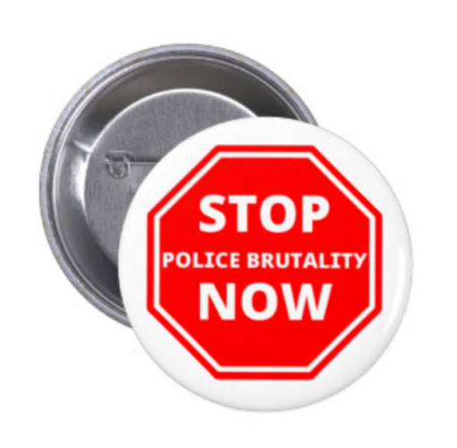
In the above photo, the creator could have simply used the words “Police Brutality.” The words ‘stop’ and ‘now’ are unnecessary, since both are implied by the stop sign symbol.
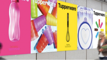
I try to place large and colorful cover photos atop each of my blog posts. When combined with a smart headline, a good cover photo can keep your consumers engaged throughout the entire post.
2. Color scheme
In the past, I’ve given design tips on how to use color to make your blogs visually appealing, noting that certain color schemes can stir up different emotions and associations within consumers. The same is true for your entire website and digital brand.
SEE ALSO: 5 Ways to Make Your Blog Visually Appealing
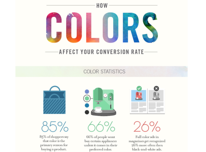
According to a University of Loyola Maryland study, color increases brand recognition by up to 80 percent. But then the question becomes, “which color should I use for my brand?”
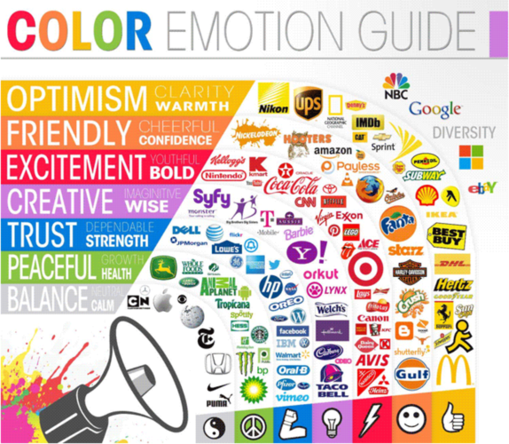
Just as marketing is not a one-size-fits-all business, no one color will convert equally well for every marketing campaign or brand. You will most likely A/B- test a few different colors to see what kind of response they receive.
With that said, this last infographic might help you in getting started. It’s all about how colors affect conversion rates — basically your dos and don’ts.
3. Font choice
As was previously discussed, consumers make certain associations for different color schemes. Similarly, they respond to typefaces and fonts.
Don’t believe me? Just check out this awesome infographic.
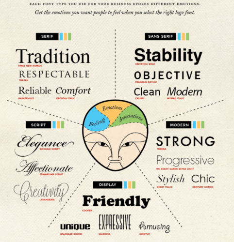
My first instinct is to tell you not to put too much weight on font type and to instead focus on your content, but I’ve personally known people to badmouth businesses for using a cliched font type in their logos and on their websites. It really offends people in design, so my advice is to keep your font type simple and professional.
4. Employ the Gestalt principles of order/disorder.
“The whole exists independently from the parts.” — Kurt Koffka (in reference to Gestalt psychology)
So here we want to capitalize on the weird fact that our brains must find order in things that have none.
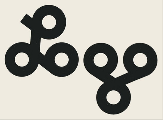
In the above photo, we see unrelated shapes, but our minds group them together to create the word ‘Logo.’ Weird right?
Where else have you seen Gestalt principles in design?
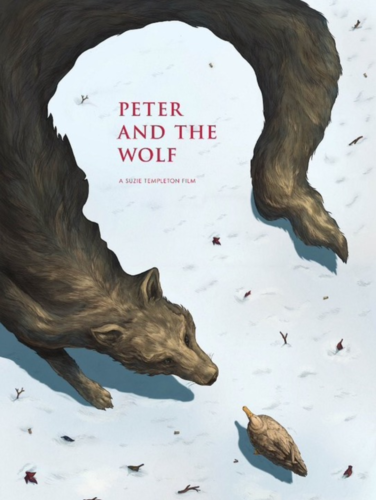
This movie poster for Peter and The Wolf demonstrates the figure-ground principle, which helps to explain which element in a design will immediately be perceived as the figure (the wolf) and which will be perceived as the ground (Peter’s outline).
This is one of the more high-level psychology based design tips, so I’ve included a link in case you’d like more info on the subject.
5. Eliminate number of choices
Remember these words: Less is more.
If you’re like most Americans you suffer from the problem of having too many options. Paralysis by over analysis.
We’re constantly on our phones, checking reviews before every purchase we make. We do this with everything, from cars to cereal.
The reason is there are so many options now- so many potentially bad options and nobody wants to get swindled, so we obsessively research to find the best deal.
SEE ALSO: How to Get More Online Reviews
Know this going in and eliminate some of the choices for your consumer, so they can focus on what’s really important about your website. The more choices you give them, the more research/ homework they’ll have to do.
If you eliminate some choices you can quickly increase conversion rate.
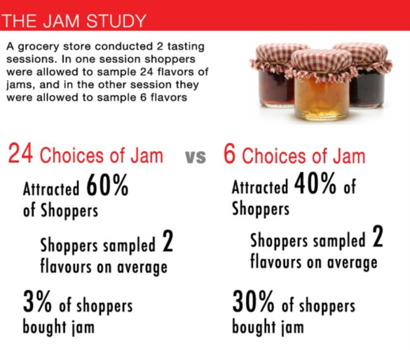
One famous example of a grocery store that decreased their number of product choices by 18 and increased sales from 3% to 30% is known as the Jam Study (below).
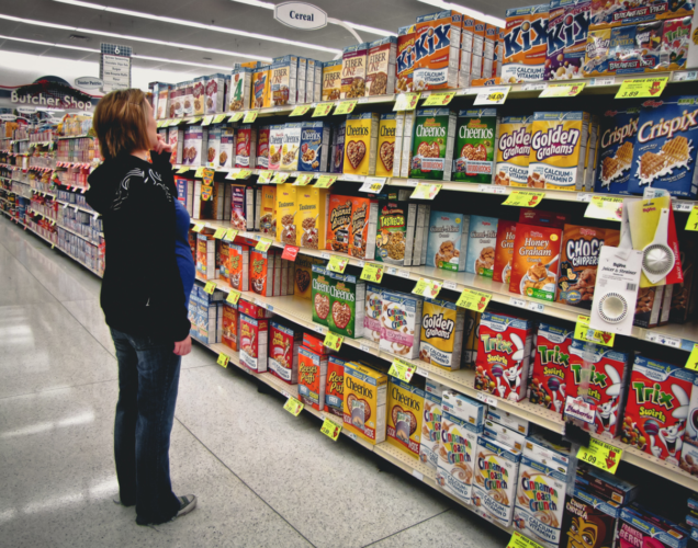
Your website shouldn’t look like the never-ending cereal aisle. Less is more.
6. Eliminate unnecessary web page clutter
Your web pages should be sleek and clean in appearance. This means, prioritizing information you want to communicate and not trying to fit everything in on one page.
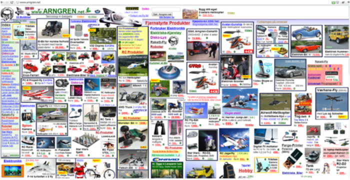
The above screenshot is a perfect example of what not to do.
OK, so how do you know what information to use? Well, that has a lot to do with your business goals, as well as the very nature of your product or service, and of course, your audience and what they want and need.
You can interview consumers individually to get a better understanding of wants and expectations. Focus groups are another good option, and so are surveys. Researching your audience will give you insights into how to design your website.
Additionally, you could use A/B – testing to see if people respond to a certain layout better than another.
In Conclusion:
While these psychology based design tips can help you increase website engagement and make good first impressions, it’s equally important to remember functionality trumps aesthetics.
Think about it — If you have a bare-bones website that’s easy to use and loads fast, and a beautiful website that doesn’t; which website do you think your customers will want to use?
Beautiful websites that don’t function well have high bounce rates and they usually don’t convert well. These psychology based design tips are important, but before tackling them, make sure your website is working properly.
Have you leveraged other psychology principles in your website design? If so, please share with me in the comments below.


