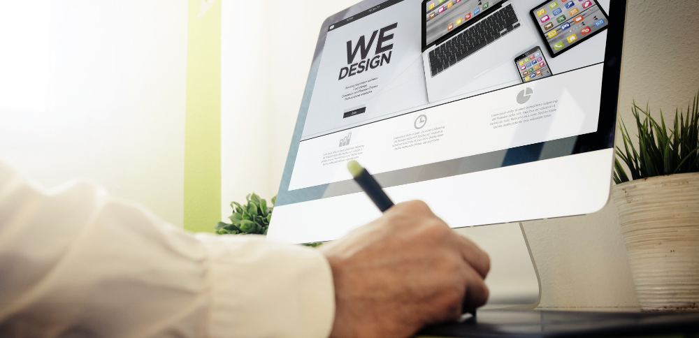
Web design trends can fluctuate quickly. The internet is constantly developing, and website creators have to continually find ways to stay relevant to their audience. These 11 popular web design trends can get you ahead of the game and bring in more viewers to your website.
As a business, you want your website to be unique, just like your business. Finding your design niche can seem hard because of all the different styles out there to choose from.
So how do you know what will work for you instead of against you?
11 Popular Web Design Trends
Following web design trends can keep your website relevant and give you an edge over your competition.
These are the 11 popular web design trends we’ve found for the coming year:
Typography
Typography is the art of words. Appealing words are a big part of web design trends.
Typography can be used to create personality, emotion, and even atmosphere. Pushing the limits of typography can make your web design more appealing to users and in the end, attract more customers.
When creating the typography to create your web design trend, remember:
1. Use a minimum number of fonts
- Using too many fonts can make your website look too busy or unorganized.
- If you use multiple fonts, make sure they’re from the same font families and can complement each other.
2. Pick the right font size
- If the font is too small it won’t be able to be read, and may just be skipped over
- If the font is too big then it can be too distracting
3. Use fonts with distinguishable letters
- Fonts need to be legible in order to be read. Fonts with poor letter spacing can meld together and be impossible to distinguish.
- Make sure you pick a font that is still clear on smaller screens
4. Avoid fonts with all caps
- All caps are fine for a logo, but not for reading
- All caps makes it difficult to speed read
5. Use the optimal line spacing
- Bad spacing will make text look crowded
- Don’t have too much or too little white space between letters
6. Make sure you have sufficient color contrast
- Make sure not to pick text colors that are too similar to their background
- Too much contrast between the text and background will also create readability issues
Making Mobile a Priority
In 2016, 43.6 percent of all website traffic worldwide was generated through mobile phones, up from 35.1 percent in the previous year. Mobile currently accounts for half of all global web pages served. – Statista
Mobile internet often provides a more reliable connection than home internet, plus a phone can always be on you, shoved in a purse or pocket. So, it’s no surprise that the strong growth of the smartphone market has really influenced how we use the internet.
In response, Google is creating the Google Mobile First Index which is set to be unveiled in early 2018. This will pull up a business’s mobile site before its typical web version.
Cinemagraphs
Cinemagraphs ride the line between image and video. These load quickly and spark interest in your viewer.
These will be used to draw specific attention to critical points on a page or post. Cinemagraphs attempt to cut through the noise of the internet and get through to your audience.
A cinemagraph will tell your short in a quick, easy to view way that engages your viewer in its looped motion.
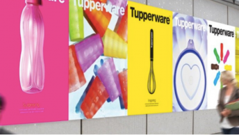
Bold Colors
You only have an instant to create a moment with your audience that will keep them on your page. ‘Web safe’ colors are now being exchanged for bold and beautiful to keep a visitor’s attention. The goal is to keep a viewer on your page long enough to convert them into customers.
This year, Instagram changed their flat colors to new transitional and multi-gradient ones. Buttons and logos all have a new colorful style, a trend that is only going to continue. The important thing to remember is to avoid anything flashy and just go with bold.
Increased Micro-Interactions
Micro-interactions eliminate the speedbumps that occur from reloading a page. Gone are the days where submitting a review caused a page to load and lose potential customers.
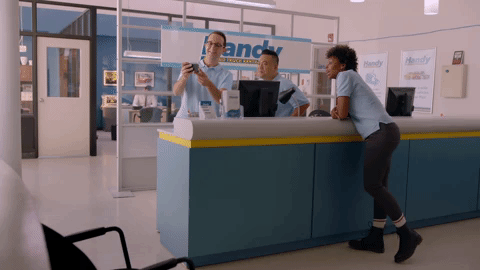
Facebook does a great job of creating places for its users to quickly interact with each other.
Without any page reloading, users can like, love, haha, wow, sad, or angry any post, picture, or video.
It is because of sites like Facebook and other social media that these micro-interactions have become so popular. In a world of instant gratification, your website needs to offer similar interactions to help grip onto your audience.
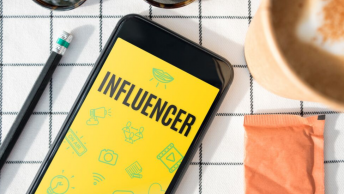
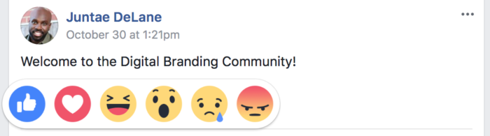
Professional Social Networks
Social media sites like Facebook, Linkedin, and Instagram aren’t going anywhere. If anything, they are only growing. So what does that mean for your business?
Utilizing these sites will greatly enhance your digital brand. Posting on them will increase your visual recognition and help other people on the site become viewers on your business site. Use these already stable formats to create drive and momentum for your own business.
Creating a business page on Facebook is a quick and easy solution to advancing your business through the popularity of Facebook. A business page will also give your audience a more personable chance to talk to you or get to know your company through comments on your page and the chat feature.
SEE ALSO: How Effective is Social Media for Driving Sales?
Chatbots
Chatbots are great programs that can talk with your viewers at any time, day or night. Simple programming is all that is needed, and then a viewer can discuss any basic Q&A program that you’ve created, or even shop your site with assistance.
SEE ALSO: Chatbots: Are They Good For Your Digital Brand?
Implementing chatbots will blend web pages and apps for a fully immersed experience.
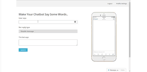
With chatbots, store hours are no longer necessary. Chatbots function as virtual assistants to answer any question (providing you’ve programmed them that way) and have a conversation about the company. And this all happens instantly!
Progressive Web Apps
The latest trend in customer preference tends to lean more towards apps than mobile sites.
App usage (90% of time) dominates browsers in mobile usage.
To increase functionality, websites are now including push notifications, offline mode, and animated page transitions. Sound familiar? This type of interaction has become a part of almost every app downloaded into your smartphone.
Adding these to your website will create what is considered progressive web apps because they still take place on your webpage but work more like apps. Now your visitors will have all of the convenience of an app but for a webpage. Adding push notifications can inform your followers when you add a new blog post, or if you respond to their comment right away.
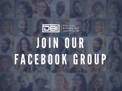
Greater Use of Negative Space
The white space, or negative space, in your web design is what helps you to stand out.
In this image, there is plentiful negative space to draw the eye to what is most important, DBI. The space isn’t filled with color or pictures because the negative space can draw in the eye more effectively.

Everything on your web page needs to be there for one reason, to make conversions. Being flashy or gimmicky won’t keep viewers on your page. Being real, simple, and straightforward does a much better job.
We don’t want visuals for the sake of visuals, find purpose and be comfortable with negative space.
Responsive Design
Responsive design is crucial now that people are accessing websites from so many different devices. It will automatically reformat your page depending on how your user is viewing it, whether it be on a computer, smartphone, tablet, or Kindle.
This program makes sure that your audience always sees your webpage in the best possible format. Pictures will still look clear and words will all be viewable without swiping right to see the rest of the screen.
Search engines are making responsive design more of a priority as well.
With more than 2/3rds of the market share when it comes to search, it’s no secret that Google is the true powerhouse of web search. As early as 2012, Google made it clear that they’re prioritizing websites with responsive design while penalizing those who do not offer responsive design. – Web Design San Diego
Scroll Triggered Animations
Scroll triggered animations are about more than just being flashy now too. Their goal is to keep the viewer scrolling. With these additions, the site turns into an experience, becomes alive for the viewer to explore.
These types of animations can also clean up the look of your website. Now it won’t be cluttered with buttons and menus, instead, it is clean and simple, only changing when you scroll over it.
Final Thoughts
Web design trends can fluctuate from year to year, and it’s important to stay on top of what your audience is looking for. Simple changes can make all the difference when standing above the competition.
These 11 popular design trends are easy changes that will keep you abreast of the ever-changing internet world, and put you quickly on your way to success.
What new trends have you noticed?