Designing your website can be fun and also stressful. These 10 graphic design rules will help ensure that you have a beautiful digital brand that resonates with your target audience.
Naturally, the visual elements of your digital brand are an important. Cultivating these elements is a necessary step in your digital brand management and shouldn’t be done haphazardly.
10 Graphic Design Rules You Should Never Break
I have seen my fair share of horrible digital brands (more specifically, websites). So, I wanted to compose a list of rules that you should consider when developing your brand imagery. By never breaking these rules, your digital brand will be in great shape and your audience will thank you.
Graphic Design Rules 1: Design with Consistency
Consistency is a huge factor in your digital brand. Without consistency, you don’t have a brand, right?
The same is true in your graphic design.
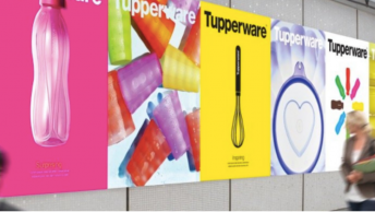
Being consistent with your graphic design will ensure that your audience never mistakes you for someone else or are poorly represented. The most important things to be consistent with your graphic design are your color palette and fonts.
SEE ALSO: How to Get Started With Digital Branding
Color Pallete
It is best if you don’t use more than five colors here. This includes the varying shades of the colors you pick. Two to three colors are probably optimum for your brand, so pick wisely.
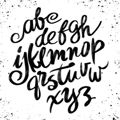
Font
You should never use more than three fonts in your graphic designing. It is also important to stick to the same family when choosing your fonts. This will give your text uniformity that will go well with the consistency of your brand.
Graphic Design Rules #2: Avoid Poor Legibility
Legibility comes into play when selecting your fonts. If your font isn’t legible, then you won’t be able to convey your intended message, and you may lose your audience’s attention.
When choosing your font, consider the demographic that you’re reaching out to. You’ll want to make sure that your font matches the feel of your brand, but it needs to resonate with your audience too.
If you’re dealing with an older audience, one 55 or older, then you’ll want a larger pixel size and a sans-serif font. This will increase visibility which will improve your user experience.
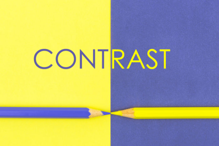
Adding an overlay of contrasting color to your font can also be useful. White against black, or vice versa, have the highest contrast. The greater the contrast, the better the legibility usually.
Graphic Design Rules #3: Avoid Color Discord
Make sure that you use colors that complement each other.

The words look fuzzy and unclear. This is because of color discord. The different colors are fighting for the viewer’s attention, making the words hard to read.
A complementary color scheme, like a yellow or purple, can use a light in dark contrast to alleviate color discord and clear up words.
When picking your colors, remember:
- Choose colors that are tonally similar, such as a palette of blue tones or a palette of red tones.
- Make sure your colors sit opposite each other on the spectrum
- Choose colors that are either warm or cool to use a wide range of colors without the risk of clashing.
- Warm colors are reds and oranges, where cool colors are blues and purples
Graphic Design Rules #4: Prevent Non-Proportional Scaling of Graphics and Text
A basic guideline here is to avoid stretching your images. Stretching your image will make it look terrible and reflect poorly on your brand. A bad design will draw the eye quicker than a great design. But negatively.

If your image doesn’t fit the first time you upload it, edit it. A small image will not scale well and may need a professional to make it work.
Graphic Design Rules #5: Stay Away from Raster-Based Images
Messing around with raster-based images will create pixelation. Using Adobe Photoshop to create your images is a sure way to get raster-based images that will have pixelation when you resize it.
Using a vector-based graphic will keep your images crisp. Unlike their photoshop counterparts, these images avoid blurry, pixelated edges. These images can be created in Adobe Illustrator.
Graphic Design Rules #6: Maintain Alignment
After spending so much time creating your website and writing your content, the last thing you’ll want it to look messy. A messy design will make you look unprofessional and reflect negatively on your brand.
A simple guideline is to pick a line somewhere on your page and align your graphics and text with it. Your line can be horizontal or vertical, and will make sure that your text and graphics don’t appear random.
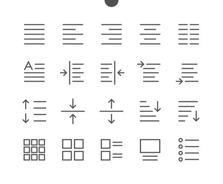
An even easier way to do this is to just to add a left alignment to your page. This will give an order to your page instead of having a jumble of text and pictures strewn across your page.
You can also add columns to give your page further organization. This will give it more of a brochure look but will need to be thought out first to ensure that it is attractive to your audience.
Graphic Design Rules #7: Only Choose 3 Fonts
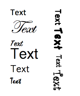
Using too many fonts will make your graphic design look ugly. It’s something that tends to be overdone and always looks bad.
Make sure that your choice of fonts is appropriate for your brand and your audience, but remember that more does not mean better. If anything, less is more in this scenario.
When choosing your fonts, be sure to pair them wisely. There are a few tried and true combinations that can help with your choices. For example, pair a high impact display font with a more subtle sans serif font. This is a high-contrast combination that does a great job grabbing attention.
When choosing fonts for a formal media, stick to two series from a similar family. This will create a classic elegant look that works great for reports or books.
Graphic Design Rules #8: Establish a Visual Hierarchy
Visual hierarchy is the use of size and color to emphasize one item over another to draw attention. This becomes particularly important on pages that are highlighting different items of text.
In more blog posts, size is used to establish the hierarchy. The heading at the top of the article should be huge to draw in the eye. The second level headings should also be large, although not as big as the main heading, and the paragraph text should be small.
Visual hierarchy weights different elements based on their importance using size and color so that it can draw the eye or let it wander. Without visual hierarchy, the viewer will be unable to determine the order in which information should be read.
The different sized fonts draw the audience to the headlines of the articles, show where to read more in a clear button, and have a smaller line of text that describes the material in a little more detail. The reader’s eye knows exactly where it needs to go to find the information they’re looking for.
Graphic Design Rules #9: Watch Your Grammar, Spelling, and Punctuation
Too many grammars, spelling, or punctuation mistakes can quickly alienate your audience. It’s a sure sign that you didn’t take the time to proofread your work and screams unprofessional to your readers.
A few small typos are understandable, but you should always take a few minutes to go over your work and make sure that you’ve cleared up anything you can see.
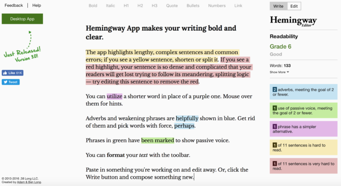
Websites like Hemingway and Grammarly are great software options that can go through your writing for you to clear up any mistakes and even give you options for bettering your work.
Graphic Design Rules #10: Embrace Whitespace
Don’t fall into the trap of thinking you need to fill every available space with graphics. Whitespace is a perfectly normal, and desirable, part of your graphic design.
Whitespace is the negative space in your design. It’s the part of your page with nothing on it, no pictures, no words, no graphic designs.

Whitespace can make your page look more professional and clean. Your audience can see where they’re supposed to go because space is calm enough for them to pick through the information available.
The simplicity that comes from leaving whitespace is appropriate for formal or casual websites and everything in between.
Final Thoughts
Following these ten graphic design rules will make sure that you never have a visually jarring design that will cause your target audience to lose their trust in your competence. Adding poor graphics to your page can tell potential customers that they are unworthy of having you as their patronage.
Rules may be made to be broken, but by following these ten rules, you’ll make sure that your graphic designs are beautiful and add to your digital brand instead of taking away from it.
What’s more important: Graphics or Content? Let’s debate this in the comment section below…