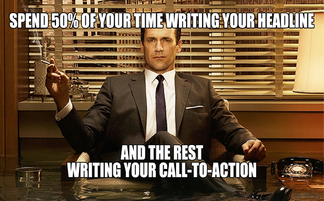
A call to action is your main connection to the reader, consumer, etc. It’s how you get them to make that first step towards buying something you’re selling or trying to convince them of. CTA buttons are pertinent to this technique.
One of the most important tasks of online entrepreneurs is to increase conversion rates and keep them as high as possible. Maximizing conversion requires an effective strategy, as persuading visitors to complete the desired action can be a real challenge.
Call-to-action buttons, or CTA buttons, are the buttons that generate a conversion after being clicked. They are profoundly important in e-commerce, obviously, and they must be designed and presented properly to be effective.
In this article, we will have a look at secrets of converting CTA buttons so that you can use them to advance your business.
#1: Wording
You’ve probably seen a lot of CTA buttons before. What do they have in common in terms of wording? Right, there are only a few words on them. Does that mean that the text is not that important?
The truth is these words are incredibly important because they describe the action needed to be taken to increase the conversion rate. The most common examples of words used on CTA buttons include: win, buy, download, get, subscribe, etc.

The secret: the first word should be effective in triggering an emotional response. It should not be boring and followed by text related to the offer.
Bad options for the first word: enter, submit
Good options: try, reserve, get, apply, qualify
The text related to the offer you’re making should also be strict to the point. Here are some examples:
- Try 10-day free trial
- Apply for free trial
- Get free ebook now
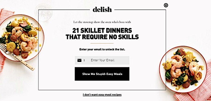
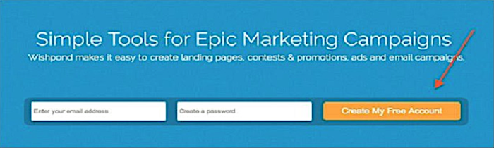
Whatever option you choose, remember: it should evoke a desire to act as fast as possible and get the offer. See the example below.
#2: Placement
There are no concrete rules on where CTA buttons should be put on a page, so the placement is really up to you. However, there are some recommendations that most web designers follow to ensure the best position.
- The buttons need to be placed above the fold. Not many visitors have the tendency to view the entire page and scroll down.
- Additional information about the offer should be placed in the line with the CTA button. It is often used in order to collect data from the visitors. They provide the information and click the button which is right there for them. Here’s an example of this placement.
- It is a good idea to provide some promotional text alongside the CTA, as well. But, you don’t want to be overly persuasive.
#3: Color
The color of the CTA button plays a significant role in persuading the viewers to click on it. According to marketers and web designers, there are no universal rules which apply to the selection of color, but there are some principles that need to be used to increase the conversion rate.
- The buttons should stand out on the page to be noticed by viewers. To achieve this, designers made them distinctive by using contrast and different colors. For example, a blue button will stand out on a light background. Here is the example from the homepage of a popular social media tool Buffer.
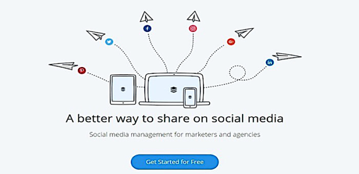
- The effort to make CTA buttons stand out should not spoil the overall look of the page. It could be done by using the color of the button for the font or some other elements. This might be a little bit difficult to achieve but the Buffer’s design clearly shows that it can be done well.
- The colors use you should be appropriate to your target audience. For example, if you’re running a site with games for kids, a bad choice would be subtle background and dark colors. For children, bright colors that make CTA buttons catchy and fruitful are a better choice.
Professional audiences may enjoy other combinations. For example, a dark elegant background and a restrained button would be a good option.
SEE ALSO: How To Generate Sales Leads From Webinars
#4: Shape
An unusual shape of a CTA button is a great way to increase conversions on your site. Creativity here will go a long way because it can attract the attention of viewers and give a fresh look to the site. We are all used to traditional button shapes, so it would be interesting to discover exceptions, like circles, triangles, and even more creative shapes.
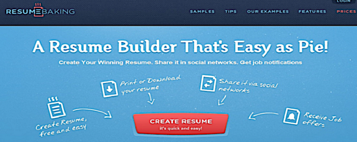
Here is the homepage of a popular resume builder service: ResumeBaking. Here, the designers changed up the shape of the traditional button, as a result, giving it new life.
The following screenshot was taken from a live demo of a beautiful site template from Template Monster (you can check it out here). It has one of the most unusual shapes you’ve ever seen.
As you can see, there so many options to go about shaping CTA buttons. The main thing to remember is to make it in accordance with the overall design of the website.
#5: No competition
As you have seen in the images above, CTA buttons are surrounded by ample space. There’s not a lot going on around them. No text, images, nothing! The button there is its own boss and demands attention.
This is yet another secret used to maximize their effectiveness. If a button is placed close or with other elements on the page, they will be competing with each other for viewers’ attention. Here’s an example of how competition can be created between CTA buttons.
The viewers could easily become confused on what they should click on first. Of course, many of them will decide to view the work of the agency before becoming a client. It would be unreasonable to click on the CTA button on the left without looking at work samples, right?
SEE ALSO: 11 Practical Tips to Optimize Your Welcome Emails
The Key Takeaways
Designing a converting CTA button is not a difficult task if one follows a number of rules and knows the secrets. Here are the secrets that we discussed in this article.
- Only a few (and appropriate) words should be included in the CTA button. They must evoke a desire to act.
- An effective CTA button is placed above the fold, maybe has a little bit of promotional text alongside but is surrounded by ample space.
- Colors can be used to make the button stand out but they should be appropriate to the audience you’re targeting.
- The shape of the buttons can be different. Creativity can be used to make it even more unique.
- No other buttons should be placed alongside the CTAs. They might confuse the viewers and decrease the needed effect on them.
Are you ready to design some landing pages with CTAs? Follow these tips to ensure that your site has the best chance to convert more visitors. Let us know the results below in the comments!