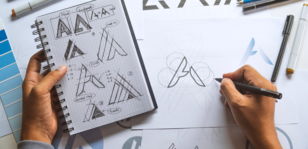
If you are starting a small business and want to make a brand that really tells the world who you are, you definitely need a logo. However, if you are not an artist and do not have a lot of extra resources at your disposal, logo design might seem overwhelming. Here are some logo design tips to get you started!
In this blog post, we break it all down so you know how to approach logo design, and what tools you can use to create the perfect logo!
Logo Design Tips To Get You Started
So, you know need a logo. But, where can you get started? If you do not have a background in design, it can seem almost impossible to know where to begin. Fortunately, you already have everything you need to get started right at your fingertips!
Look At Competitors
Chances are that many others in your niche already have logos. Take a look at the logos that others in your area have already created. Study them closely. Come up with a list of 5 logos that you like and 5 logos that you dislike. Figure out what is about them that either draws you in or repels you.
Do you find certain colors appealing? Or, do you really hate certain fonts? Do the logos that you like tend to be more minimal and clean, or elaborate and loud? Do you find bright colors attractive and fun or tacky and immature? Look at the websites and social media profiles of your competitors. Really think about what works for you and what does not.
One of the biggest logo design tips is just to figure out what you like!
Remember, you do not only want to apply this strategy to logos. It is important to be aware of what your competitors are doing across the board in many different areas. Note where they are successful and where you think they could improve things. You can learn a lot this way.
Consider Your Own Business And Brand
Whether you have a background in design or not, you definitely know your own business inside and out. This is an incredible strength when it comes to creating the perfect logo for your brand. If you feel stuck, it may be time to write it out.
Writing it out is one of the key logo design tips. Write down what you are selling or what services you are offering. Then, write down the descriptive words that are tied to it that you want to be a part of your branding. For example, say you are selling handmade bridal veils. The descriptive words you would choose for your branding might include:
- Elegant
- Luxurious
- One-of-a-kind
- Romantic
- Feminine
Based on the words you choose, you will be able to create a brand persona bible. A brand persona is a combination of personality traits, attitudes, and values that a business consistently portrays through its branding.
It is where your logo and all of the visual and written elements of your branding will come from.
SEE ALSO: Digital Branding Checklist for Small Businesses
Understanding Logo Design Elements
When it comes to logo design, it is important to get specific. A simple “I just want it to look good” or “I want it to look cool” really will not cut it. Statements like these mean many different things to many different people.
To start on practical logo design tips, let’s break down the different types of logos that you can have.
Pictorial Mark
Pictorial logos are entirely image-based. Many of the world’s largest companies use pictorial logos. For example, Apple keeps things simple with its minimal and world-famous bitten apple logo.
This type of logo has its pros and cons. Eventually, if you plan to go global, this is a very smart choice. Graphic images and symbols transcend language barriers and can be recognizable around the world.
However, a pictorial mark can be a tricky choice for a brand new business. While brands like Apple, Target, and Twitter are world-famous entities that are instantly recognizable by their pictorial logos, the same does not apply to a new small business.
Ultimately, when choosing an image logo, you want to use something deeply relevant that will stick throughout your company’s entire existence. This can be simple, but it can also be complex. While brands like Apple and Target take this literally by having their logo be an apple and a target, you do not have to be literal.
For example, did you ever wonder why Snapchat’s logo is a ghost? It’s because the messages you send on the app vanish, much like a ghost.
Lettermark And Wordmark
Monogram logos or lettermark logos consist of a few letters. These are usually brand initials. One example of this is NASA, which stands for the National Aeronautics and Space Administration. They used this simple and effective “worm logo” from 1975 until 1992.
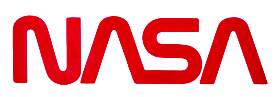
If your business has a lengthy name, this may be a good choice. However, as a new business, you may want to add the full name of your company below the lettermark, so people can begin to recognize it right away. However, as this type of logo relies largely on color and font, you have to take extra care to make sure they are just right.
Wordmark
A wordmark or a logotype is a font-based logo that contains an entire company name. Coca-Cola, for example, has perhaps one of the most recognizable wordmarks on the planet.

This type of logo is ideal for companies with short and snappy names, like Coca-Cola or Google. While you may be tempted to choose a wordmark logo just to get your name out there, this can backfire if your company name is very long.
Remember, your logo needs to be adaptable across marketing material. It needs to look great online, on printed materials, and maybe even on things like pens and t-shirts. If your wordmark logo is too long it will look cluttered and unappealing.
Typography
When it comes to lettermark and wordmark logos, everything is resting on the typography you choose, so you want to make sure to choose a color and font that makes sense. If you are having trouble choosing, refer to your brand persona bible.
For example, say you have included words like professional and authoritative as key brand traits. Would a neon yellow lettermark in a curly font portray that? Or would something in muted colors in a heavier and more traditional font get the job done?
If you like, you can even make your own font. However, you do not have to.
Abstract Logo Mark
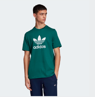
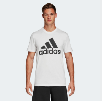
Abstract logo marks are a type of pictorial logo. While pictorial logos feature recognizable real-world images, such as Apple’s apple logo or Twitter’s bird logo, abstract logo marks feature shapes. Adidas has several famous abstract logo marks that often appear with their company name or alone.
This type of logo allows you to condense your brand to an image without worrying about any of the possible negative connotations that pre-existing icons or ideas carry. Geometric shapes are generally non-inflammatory and non-controversial.
However, if you are just starting out, it may take a long time to get people to associate this shape with your business. It can be a smart long-term move, however. These types of logos also lend themselves well to global commerce as they transcend language barriers and do not require translation.
Mascot
A mascot is an illustrated character that represents your company. Their look, voice, personality, and even their catchphrase should all make sense with your brand persona. While they can be fully realized characters, like Disney’s Mickey Mouse, they do not necessarily have to be.
If you feel like you are out of your league when it comes to creating a mascot, keep this in mind: one of the most iconic logos of all time, Planters’ Mr. Peanut, was created by schoolboy Antonio Gentile back in 1916.

One important logo design tip is to consider your audience. You might want to choose this type of logo if your brand caters to children. There is a reason that so many things that are branded for children feature different types of cartoonish logos. These include Cheetos’ Chester Cheetah and McDonald’s famous Ronald McDonald.
However, this type of logo can have its limitations. Highly detailed logos are not universal when it comes to marketing applications. For example, what looks beautiful in an animated ad might not translate well onto a business card.
Combination Mark
A combination mark combines any of the logotypes. The Adidas t-shirts pictured above actually feature combination marks as they include both an abstract logo and a wordmark. Many of the world’s largest companies opt for this type of logo.
This is a great option for businesses that are just starting out. It puts your business name front and center and allows people to start to associate it with your logo right away.
In the future, you might want to remove your name and rely on the pictorial logo only. Also, keep in mind that combinations of symbols and text create a distinct image that may be easier to trademark.
Emblem
An emblem is a font inside of a symbol or icon. These logos are commonly used by schools, universities, and organizations. However, they are also some of the most recognizable logos in the world.

Emblems can be highly recognizable, but depending on the intricacy of their designs, they might not translate well across all branding materials.
Common Logo Mistakes To Avoid
Having an effective logo can work wonders for your brand. Having some logo design tips up your sleeve is important. However, you also need to know what to not do. Avoid these common beginner mistakes to ensure yours is a perfect fit for your new business.
Doing Too Much
Of course, you want your logo to say a lot. However, if it is too busy, it will likely confuse people. Also, if it is jam-packed with too much detail, it will not translate well across marketing and branding materials. You want something that looks just as good on your social media pages as it does on a mug or a business card.
You want it to be memorable. If there is too much going on, it will not make an impactful and clear first impression.
One of the biggest logo design tips? Less is more.
Copycat
While you want to study the logos of other brands to find elements of them you like, you do not want to copy them too closely.
For one, if you get caught stealing another company’s logo, they are within their rights to make you stop using it and take legal action against you. Also, you do not want your brand to become known as the brand that steals other people’s work. This is a terrible reputation to have.
Of course, you cannot check the design of every logo in the world. However, take a look at the logos of your closest competitors. You do not want your logo to appear to be direct theft. You also do not want it to be so similar that it causes confusion between your brands.
Too Trendy
It can seem like a no-brainer to capitalize on trends to get your business noticed. However, trends shift quickly. Ideally, you want a logo that can stay with you throughout the entire lifespan of your business. If you opt for something too trendy, your logo may appear outdated in a matter of weeks.
Losing Focus
You want your logo to be visually appealing. However, it must also align with your products or services, the rest of your digital branding, and your brand persona. Your logo might look amazing, but if it clashes with the rest of your branding, then it is not the right one for you.
You want to present a unified personality that is consistent and engaging through branding. Your logo is just one part of that puzzle.
Logo Design Tips: Tools Edition
These tools can help you through all of the stages of creating the perfect logo for your business.
- The Logo Inspiration Generator Tool: This free tool helps you find high-quality logo inspiration that is relevant to your needs. You can search for logos by style, color, and more.
- Wordmark.it: If you want a text-based logo, this free tool can help you see your company name or initials written out in every font currently on your computer at once. This makes comparing them easy.
- Cymbolism: This free tool uses crowdsourced data to help you match colors with meanings or words. You can search both by word and by color to find out what people most associate them with.
- Canva: With Canva, you can make a simple logo for your brand in a few minutes. You can use a stripped-down version for free, however, you will need to pay to unlock more features.
- Logo Rank: If you have already made your logo and want a more quantitative take on its uniqueness, legibility, and overall efficacy, Logo Rank can help. When you upload your logo, AI will compare it to over a million other logos and give you tips.
SEE ALSO: 10 Free and Cost-Effective Tools and Apps to Give Digital Branders an Edge
Final Thoughts On Logo Design Tips
Starting a small business and creating a brand to showcase and grow it is a complex process that requires a lot of careful work. Your logo is just one important piece of this overall journey. As the creator of your small business and brand, you know them best. This is why, with some logo design tips and some helpful tools, you are in a great position to create your logo.
Which of these logo design tips did you find the most surprising? Let us know below…


