
The new Google algorithm change can significantly impact your business. This post outlines the necessary steps to ensure your business is not affected.
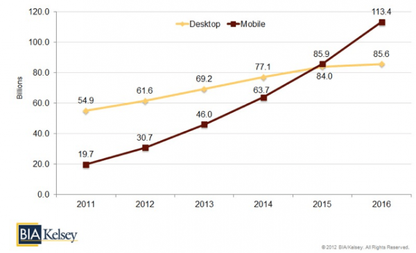
Consumers use their mobile device more than ever. They use it to communicate, manage productivity and consume content. They also use it to search online.
In fact, in 2015 mobile local search is expected to surpass desktop local search for the first time. By 2016, BIA Kelsey expects mobile to exceed desktop by 27.8 billion queries.
It seems Google is well aware and has made adjustments to its algorithm. Google officially announced that it will now favor “mobile friendly” sites when displaying users’ search results.
Essentially, mobile-friendly websites will rank higher on Google search and websites that are not mobile-optimized will suffer.
So, what does this mean for your site? Well, if your site is not responsive or mobile-friendly, you stand the chance of being missed by potential customers while searching for a product or service that you sell. As competitors are vying for consumers’ attention, it is important to take this algorithm change seriously.
Here are 4 ways to overcome the new Google algorithm change
1. Don’t Force Users To Pinch and Zoom

One way to determine if a website is mobile-friendly is when the site eliminates the need to pinch and zoom while browsing the site on a mobile device. Although connected devices can browse any website, the user’s experience is completely different when browsing on a desktop.
For instance, a user’s intentions can be completely different when browsing a mobile site. Particularly, they are looking for contact information, location, or to purchase a product or service.
When users have to pinch and zoom to find this information, businesses will risk loosing that consumer. Overall, a site that’s designed with this in mind will be favored in the new Google algorithm change.
2. Eliminate Misaligned Technology
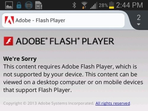
If you haven’t updated your site within the last 3 years, chances are that you may have some flash elements such as menu animations or video.
If you have flash incorporated in your site, I would suggest eliminating it altogether.
3. Right-Size Content and Images

Just because mobile browsers can display regular desktop images, there is a chance those images will consume more data and device resources during the download. This can also drain the device’s battery and delay engagement.
No Bueno.
Desktop images may not always display correctly on mobile devices. Ensure all website images account for mobile device rendering so that a user’s mobile experience is optimized.
4. Tailor to Touch

Ensure your mobile website links, buttons, and calls-to-action are placed to allow users to easily tap correctly. A pet peeve of mine is having to use two hands when browsing on my mobile device. Most mobile operating systems consider this and make it easier for a user to complete an action with one hand.
As shown above, your important buttons and links should be located on the lower right corner (as it’s common to tailor to right-hand users). The red areas are mostly used for branding purposes.
Final Thought
If your website has one or more of the elements mentioned above, there’s a chance that Google considers it mobile-friendly.
However, you can check if your site meets Google’s mobile-friendly specifications here: https://www.google.com/webmasters/tools/mobile-friendly/
If it doesn’t, use the functions I suggested above when you developing your mobile-friendly website.
That’s how you overcome the Google algorithm change!
