Web design trends seem to change with the seasons. Is your website fashion forward?
I was once told that you can determine a man’s personal upkeep by analyzing the cleanliness of his shoes. I can understand arguments both for and against this notion.
But what does this have to do with your website design.
Everything!
Looking for the cleanliness of a man’s shoes is as superficial as looking for a website with a trendy design. The biggest difference is potential profit loss for your business.
Thankfully, the folks at Red Website Design developed an infographic that outlines 20 web design trends.
To view the information clearly, I have transcribed the infographic. Here are the key insights…
20 Web Design Trends
TYPOGRAPHY
One trend we think will be popular in 2015 is adding 3D effects to typography and illustrations. This would include gradients, shadows, and color overlays.
There are a lot of designers who are pushing the 3D effects typography can have and they are starting to bring subtle gradients back and using multiple colors to create depth.
There are also a lot of type designs with various forms of shadows added to create a sense of depth. Using strong shadows and gradients in illustrations makes the work more dimensional. This style lends itself well to making designs more modern looking.
MOBILE OPTIMIZATION
One trend we’ll see will be mobile optimization with a better understanding or user needs and performances. Responsive Web design detractors say that it’s bad for performance, but that’s mostly the case when it’s poorly done, when people try to make a 1900px 10MB site fit into a 320 mobile phone.
I see more and more articles and talk trying to make performance a “must have” for sites, so I really hope to see more mobile optimized sites loading fast in 2015.
- SVG – Simple, flat, colorful design, with hopefully more (and better) support for SVG.
- Flat Design – Flat design will continue in 2015 as well. However, template looking flat design will be replaced by more customized and personalized flat designs.
- Wearables – I noticed this is already starting to emerge but now that apple has officially hopped on board with the Apple Watch, there will be lots of new opportunities here for companies to put their app on a wrist.
FULL-SCREEN MEDIA
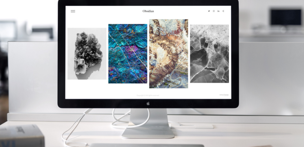
People love websites with big full-screen displays of images, type and video – it’s simply more immersive and engaging. In 2015 we will see an even greater use of large background images and full-screen video as a way to connect with visitors and communicate a brand’s personality.
This approach to web design will slowly kill the traditional brochure as a means of selling a service. Bandwidth, typography and modern browsers have all evolved to create an environment that can now rival that of print and we expect companies to put more of their dollars into these digital canvases.
BIGGER TEXT & BIGGER IMAGE-DRIVEN WEBSITES
With the increased usage of Retina and HD screens, it’s now essential for designers to serve large copy-driven text and high-resolution images that will resize and optimize for both server load and screen sizes.
CARDS, CARDS, CARDS
Card are small contained pieces of information, visually delimited by their card like appearance: A border around or a drop shadow, often with a white background on a grayish site background. They hit right in the spot of users wanting small information bites before digging through the real – possibly lengthy – content.
I understand them as an entry point. After a click/touch the user gets more information about the displayed content.
Twitter uses them, Google (Google now), Facebook – just to name some. What makes them so great for designers is that they are universally applicable: On mobile, show one column with separate cards under each other, show multiple columns on desktop.
They magnify general design problems into smaller easy to handle piece. Definitely a trend for 2015!
- Animation – We’re starting to see a lot more interaction design on the web. Small bits of transitions and animations for pretty much any action we take. It’s effective if it’s not overdone.
- Performance – The evangelism for fast websites has been good. Our tolerance for slow sites is lessening.
- More Pixels – As we know now, we need more pixels. All devices go with retina resolution so I hope in 2015 we have no need for those old devices with poor resolution.
PATTERNS
The last few years has seen a complete abandonment of skeuomorphism. In favor of solid block color. I think soon enough we’ll see a few more patterns being introduced. Think more ‘geometric’, rather than compliment minimalist design.
LOW POLY STYLE
One trend we expect to see more and more: the low poly style. I think that 2014 was a prolific year for this visual style with many original visual interpretations and implementations of it, but I expect to see even more projects designed using this technique.
To conclude I would like to say that I imagine these 3 trends to be more and more visible in the near future not only in the logo design field, but also on the online, mobile and digital mediums, part of the extended implemented identity design or approached as stand-alone styles.
LONG SCROLL
Users are now used to scrolling more than they click. We think the long-scroll website trend will continue to become more and more popular in 2015, meaning companies will need to continue simplifying their content – at least on marketing and sales sites. Oh, and don’t forget the parallax (use sparingly, please)!
WEB TRENDS
- Simple Colors – Simple colors must be popular for sure, would be great with some skeuomorph icons.
- Community – Buzzwords like content-first, mobile-first, offline-first, etc. belong to a greater knowledge we start to collect as a community about what good design for the web really is.
- Applications – We will probably see more tools (both for designer and for coder) to help release applications on multiple platforms and resolutions, because it is becoming exponentially more difficult to handle everything on the text editor.
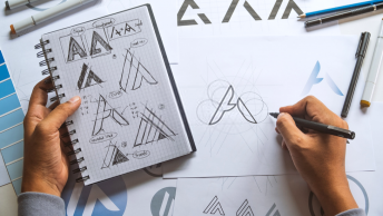
HAND-DRAWN ELEMENTS
More a preference than a forecast, I would love to see the resurrection of illustration and hand-drawn elements that ignited branding design move into web design as well.
That kind of spectacular typography and organic details used in subtle, intentional ways would be very exciting for the web.
RESPONSIVE TYPOGRAPHY
Responsive typography will start to become the norm. Being aware of the varying reading distances and viewpoint sizes content might be employed on means that one type scale won’t necessarily work for all experiences.
Designers need to be aware that their text-on-screen might be consumed at arms length or at room length. More care and time will be put into ensuring reading on-screen is always painless.
Keep an eye on those type foundries that are putting the additional time and consideration into creating typefaces that are screen-ready.
INFOGRAPHIC

